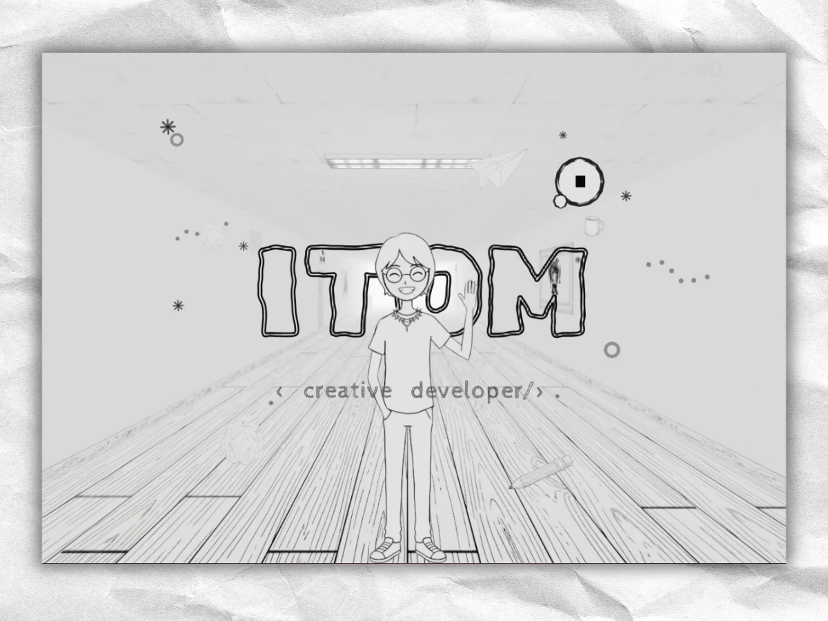
The Story Behind the Portfolio
I can’t model in 3D. That admission serves as the backbone of my entire project.
During my quest for inspiration, I combed through platforms like Awwwards and The FWA, often landing on visually stunning sites like Igloo Inc, which features an engaging mix of 3D elements and infinite scrolling. The spark came when I stumbled upon Bruno Simon’s portfolio showcasing a little car navigating a creative landscape. I was inspired to create a similar 3D portfolio, but here's the kicker: my lack of Blender skills meant I had to get creative.
Instead of grappling with complex models, I opted for something simpler. Why not utilize basic shapes—rectangles, planes, cubes—and dress them up with charming hand-drawn textures? I may not have been able to sculpt in Blender, but I found my own way to paint a digital world, sketching it onto flat surfaces. This unconventional route became the core visual identity of the project.
You can find the source code on GitHub.
Challenging the Norms
Take a stroll through any Facebook group dedicated to developers flaunting their portfolios, and you’ll notice a staggering trend: the majority share an unfortunate similarity. Most are styled with dark backgrounds, neon accents, and a conventional layout—text aligned on one side, imagery on the other. Quite a few could easily be mistaken for AI-generated work, adhering rigorously to an ethereal glow on a black canvas.
While I appreciate the technical execution of those portfolios—many offer solid UX—I yearned for an environment that allows visitors to engage actively rather than just passively scrolling. I wanted my portfolio to be a space, a place where users could navigate through and truly experience my work. Contact details would find their way to users naturally; I wasn't overly concerned about making every path obvious.
This eagerness led me toward crafting a portfolio that could be explored on foot, rather than simply scrolled through.
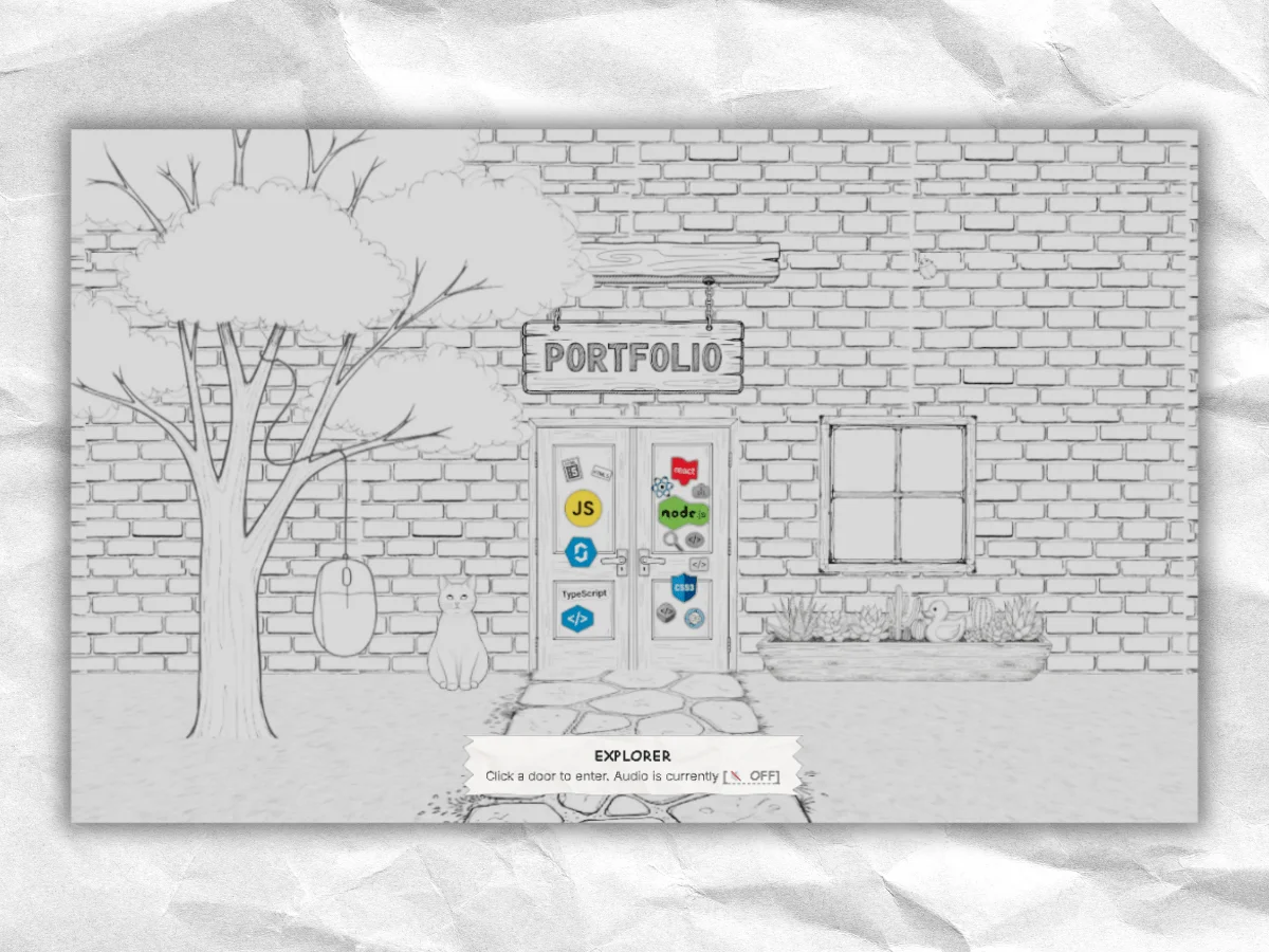
From Vision to Reality in Four Months
The initiative took off in December 2025, originally envisioned as a simple illustrated website adorned with hand-drawn textures. However, I quickly realized that a flat HTML design wouldn’t suffice to convey depth. I shifted gears, embracing Three.js and React Three Fiber, and suddenly, I was in the midst of building immersive rooms.
What emerged four months later was a living project, alive with interactive challenges, from camera dynamics to scroll mechanics that were unfamiliar terrain for me. On top of that, I generated a plethora of textures using AI—there was no way I could create them all by hand.
Tech Stack Overview
- React 19 alongside React Three Fiber 9 and Three.js 0.182 for the 3D environment
- GSAP 3.14 drives all animations, from camera movements to door transitions
- Vite 7 serves as the builds and development server
- Custom GLSL shaders enhance the visual experience
- AI-generated WebP textures optimized for flat geometries
- Utilized PostHog analytics and Lenis for scrolling behavior
Creating a Hand-Drawn Aesthetic
This hand-drawn look wasn’t a fallback; it was the vision from the start. I wanted the portfolio to evoke the feeling of flipping through a sketchbook, where the drawings leap into a 3D reality. The choice of paper textures and ink-line designs was intentional. As development progressed, I began to experiment with color interactions. What if hovering over elements caused them to fill with color, effectively painting them into existence?
This approach became the project’s defining feature. Each interactive element transitions from monochrome to vibrant color upon hover, facilitated by a custom shader—the brushstroke effect provides an intuitive cue that invites user interaction.
Unpacking the PaintRevealMaterial Shader
This shader was developed by extending Three.js’s MeshBasicMaterial, integrating custom logic into the fragment shader to achieve a blend between a sketched and fully painted texture:
// Brush-stroke blend: progressively swap sketch -> painted
if (uProgress > 0.001) {
    vec4 paintedColor = texture2D(uMapPainted, vMapUv);
    float rn = paintNoise(vMapUv * 15.0) * 0.15;
    // Reveal from bottom-left to top-right for organic feel
    float maskValue = (1.0 - vMapUv.y) + rn;
    float threshold = uProgress * 1.5;
    if (maskValue < threshold) {
        diffuseColor = vec4(paintedColor.rgb, 1.0);
    }
}
This noise function creates a fluid aesthetic, so the paint appears to flow across the surface rather than just covering it. The animation of uProgress is handled seamlessly by GSAP on hover.
The decision to extend MeshBasicMaterial instead of starting a shader from scratch was pragmatic—this approach ensures that all texture processes like UV mapping remain intact while only modifying pixels that reveal painted visuals.
Keeping a consistent visual style across all assets was a daunting task. I used AI to generate a multitude of textures, carefully sifting through versions to maintain coherence in that hand-drawn aesthetic.

The Concept of the Infinite Corridor
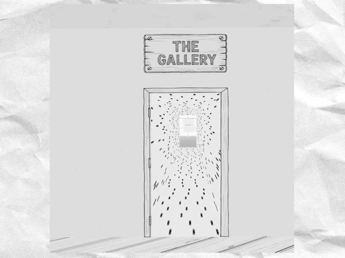
At its core, the concept is deceptively simple: you enter through sketched double doors and are greeted by a corridor that seems to stretch indefinitely. Alternating along the walls are several doors, each granting access to unique worlds.
Implementing a Chunking System
The corridor is composed of repeating segments, each measuring 80 units, managed dynamically by an InfiniteCorridorManager. At any time, only three segments are active: the one currently in view, one ahead, and one behind. As you scroll, segments spawn or disappear seamlessly.
Each segment features a SegmentVisibilityWrapper that utilizes useFrame to track visibility. If a section moves out of the camera's view by five units, it becomes invisible, minimizing resource expenditures on off-screen geometry.
useFrame(() => {
    const isBehindCamera = camera.position.z < endZ - 5;
    const isFarAhead = camera.position.z > startZ + 30;
    const isVisible = !(isBehindCamera || isFarAhead);

    if (groupRef.current.visible !== isVisible) {
        groupRef.current.visible = isVisible;
    }
});
Creating the entrance led to some intricacies. While users should first see the doors, the corridor still needs to exist behind them for shader pre-compiling. To resolve this, I created a hideDoorsForSegments array to conceal doors during the user’s initial entry, only revealing them once they cross the threshold.
Navigating the Camera System: Lessons Learned
The useInfiniteCamera.js file stretches over 500 lines. Interestingly, it seems every line was necessitated by a bug or challenge I had to remediate.
This camera system is multi-faceted, tackling various functionalities:
- Scroll movement harnessing GSAP’s Observer to unify inputs from mouse wheels, touch, and trackpads
- Mouse parallax allowing gentle shifts in the corridor as users move their desktop mouse
- Gyroscope parallax on mobile, where tilting the device affects the corridor’s angle
- Auto-glance that gently nudges the camera’s focus toward a door as you approach
- Keyboard navigation support via arrows, the space bar, and Page Up/Down for inclusivity
- Camera override mode that activates when GSAP is in control during door animations
The auto-glance feature is particularly noteworthy. It gauges proximity to doors using a distance model, calculating entry, peak, and exit with eased intensity.