MERSI, an architecture studio based in Paris, is recognized for its meticulous and visually-rich design philosophy. Their previous website, however, fell short in capturing the essence of their work. When MERSI reached out for a redesign, they specified a desire for a digital portfolio that embodied the sophistication and quality synonymous with their architectural achievements.
This project represented more than an aesthetic upgrade; it required a holistic transformation. A fresh visual language was implemented combined with a custom Webflow design that emphasized a narrative approach, sharply aligned with their architectural ethos.
The task was clear: design a digital experience that could navigate the nuanced space between an architectural publication and an immersive interactive platform, forging a deeper connection with their audience.
A Departure from the Generic
Before the redesign, MERSI’s website was merely a reflection of potential unfulfilled. A templated format did more than just limit creative expression; it diluted the uniqueness of their brand. Operated under a subscription service, this template-driven approach constrained their capability to express their artistic identity fully.
The missed opportunity to convey MERSI’s distinct identity fueled discontent internally and publicly. In an industry where aesthetics and precision form the cornerstone of credibility, relying on a generic website inevitably falls flat. Ultimately, the previous iteration of their website simply didn’t serve as a worthwhile asset; it existed merely as a bland placeholder.
With this understanding, our mission was clear: restore MERSI’s control over its online identity. We aimed to create a narrative that reflects their architectural narrative, re-establishing their stake in digital representation.
Leveraging Webflow for Customization
Choosing to work with Webflow was pivotal. MERSI was familiar with the platform, which made it not just a convenience, but a strategic choice. Abandoning Webflow entirely wasn’t an option; instead, we aimed to break free from the limitations imposed by their previous, outdated template.
Our approach was to retain Webflow as the content management system while re-engineering the site's interface and interactivity. This was essential; Webflow itself offered potential, and the issue lay solely with the previous template constraining creativity.
By discarding their generic layout while maintaining the platform, we were able to empower MERSI with a more liberated form of creative expression. This retains not only ease of management but also injects vitality back into their digital identity.
Cultivating a Brand Identity
We also undertook a noticeable brand enhancement through this redesign. MERSI’s existing logo, designed by Morgane Tubiana, was leveraged rather than replaced. The goal was to refine the overall visual identity to align better with their sophisticated approach.
Previous branding leaned heavily on vibrancy, which failed to resonate with MERSI’s understated sophistication. Shifting towards a more muted, luxurious aesthetic aimed to evoke precision and confidence without unnecessary embellishments.
The result was a design characterized by restraint. It didn’t shy away from minimalism; rather, it sought to create a framework that highlights MERSI’s architectural projects, allowing their artistry to be the star of the show.
A Digital Experience Between Print and Interactive Space
Our vision was focused: integrate the richness of printed architectural portfolios with the dynamism of digital interfaces. Traditionally, architecture is showcased in books and carefully curated portfolios, each crafted with a unique rhythm and sensibility.
For the MERSI website, we translated that sensitivity into a web context, equal parts elegant and engaging. Each page layout was tailored with strong editorial principles. Composition wasn’t just about filling spaces; it was an artistic arrangement where typography and imagery interacted as structural components.
Interactions were meticulously designed to foster a sense of rhythm and movement. The resultant experience is tranquil yet captivating, effortlessly surprising viewers along the way.
Designing with Purpose
At the core of this project lay a straightforward goal: amplify MERSI’s architectural works. Yet, this was no simple task. Many project images were in portrait orientation, which often clashes with standard web layouts, leading to awkward cropping or repetition.
Instead of restricting ourselves to a conventional grid, we crafted a fluid visual framework. This design choice embraced the uniqueness of portrait art, establishing a visual experience closer to a gallery exhibition than a monotonous series of images.
Every project required distinct curation; we strived to envelop each image with its own narrative space, guiding viewers through MERSI’s portfolio without burdening them with excessive interpretation.
In essence, the challenges focused not on adding layers of design but curating an environment where each piece could truly thrive.
Showcasing with a Signature Slider
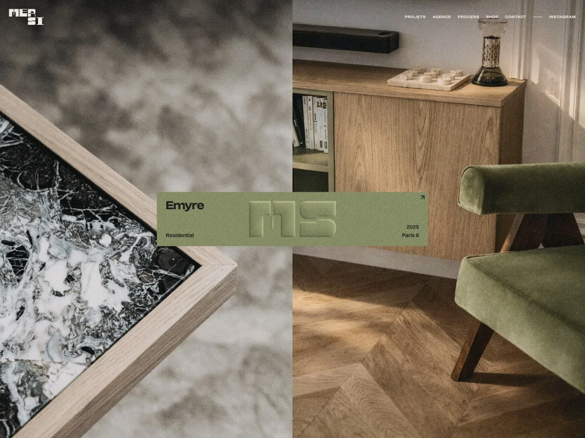
A striking feature of the redesigned site is the split-screen slider. This element juxtaposes two substantial visual areas alongside an anchor labeling system. It creates an intriguing tension while also providing meaningful context.
This split-view approach encapsulates MERSI's vision: editorially rich, minimalist, yet thoroughly interactive. It strikes a balance between user-friendly interaction and deep engagement—inviting visitors to traverse a visual landscape densely layered with depth and nuance.
Simplifying the Transition to Case Studies
Transitioning into detailed case studies was crafted to be memorable. Instead of a typical loading sequence, project covers perform a flip, guiding users into the case study platform. It's about creating a fluid connection that enhances storytelling and exploration.
The cover image becomes more than just a static display—it acts as a transformational gateway into the project's narrative. Subtle material characteristics necessitate that every interaction align with the site's visual language, maintaining a coherent experience.
Users are welcomed into each project in a manner reminiscent of opening a book, creating a tactile experience grounded in thoughtful design. Each case study employs a horizontal scroll mechanism, presenting a cinematic, editorial journey through MERSI’s architectural stories.
Dynamic Project Repositioning
As visitors scroll through the projects page, a significant interaction unfolds—projects shift into a more organized grid layout. Initially displayed in organic compositions, the layout transitions into a structured format as scrolling continues.
This evolving design embodies a thematic exploration of balance—reflecting both chaos and structure inherent in architectural design. Projects evoke fluidity yet remain firmly rooted in a solid architectural framework.
This isn’t a simple visual trick; it enriches the storytelling aspect, transforming a static index into a spatial narrative that fluidly organizes itself according to user interaction.
Crafting a Custom Webflow Experience
The MERSI website stands out, thanks to meticulous customization on the Webflow platform. Using Webflow's structural and CMS capabilities allowed MERSI to retain content ownership while developing a distinct, engaging user experience.
Instead of highlighting Webflow’s constraints, the focus shifted to maximizing its strengths. The resulting design not only feels tailor-made but empowers MERSI with straightforward content management, sidestepping the often stifling "template feel" associated with such platforms.
Technical Framework
The site utilizes Webflow for its structure and content management system, coupled with a custom JavaScript layer built with Vite and hosted on Netlify. The animation stack incorporates:
- GSAP (with ScrollTrigger, SplitText, and Flip) for animations
- Lenis for smooth scrolling
- Taxi.js for seamless page transitions
- Splide for the dynamic news slider
Additional functionalities were integrated using custom vanilla JavaScript—eschewing reliance on broader UI frameworks.
What’s Behind the Cover Flip Transition for Case Studies?
Two transition types have been programmed within Taxi.js: a DefaultTransition (curtain wipe) and a FlipTransition for project links. When exiting a project, the FlipTransition captures the visible slide image and replicates it into a fixed overlay, maintaining fluidity.
Upon entering a new project, GSAP animates the floating clone, transforming it into the destination seamlessly. This animation creates a visual continuity that enhances the user experience significantly—drawing them deeper into MERSI’s projects.
On mobile devices, this flip mechanic is omitted. Instead, clip-path animations play a role in providing visual continuity.
How Does the Horizontal Scroll Feature Function in Case Studies?
The horizontal scroll employs GSAP ScrollTrigger for interaction: a pinned .horizontal_track element translates based on user scroll actions.
- The total X distance is calculated based on current project widths and window sizes, readjusted on refresh.
- The ScrollTrigger's ending point adjusts dynamically to ensure a perfect alignment.
- Scroll events trigger updates, ensuring the experience remains fluid and seamless.
- This system prepares for asynchronous callbacks, preventing unintended shifts in layout.
Describing the Project Grid Repositioning Animation
This is arguably the most sophisticated component on the site. The projects page operates with two distinct DOM states.
As users scroll, GSAP Flip manages transitions between grid states, ensuring a refined visual fluidity. This aesthetically pleasing animation enhances the experience while also making the navigational elements far more engaging.
What Structure Supports the Split-Screen Slider and Central Label?
The home and project sliders are set up using a synchronized framework: two lists of images overlapping in a shared visual space, creating a seamless interplay as users scroll. This structure promotes a scrub-like quality that diverges from traditional scrolling formats.
An innovative approach to infinite looping lets the sliders transition smoothly, maintaining constant engagement without compromising the user experience.
Infinite Slider Repositioning Mechanism
Engineered to accommodate extensive scroll cycles, the home slider is crafted for ongoing transitions, optimizing user experience through thoughtful design choices.