Crafting an Infinite GSAP Scrolling Gallery: Parallax and Flip Transitions Unpacked
Discover the step-by-step process of creating an infinite GSAP gallery featuring parallax scroll effects, revealing animations, and Flip-powered full-screen transitions.
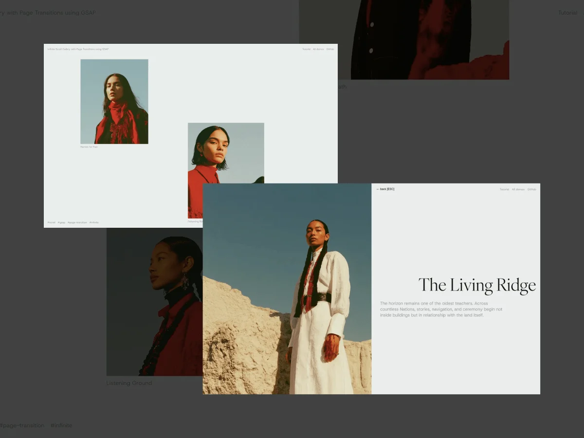
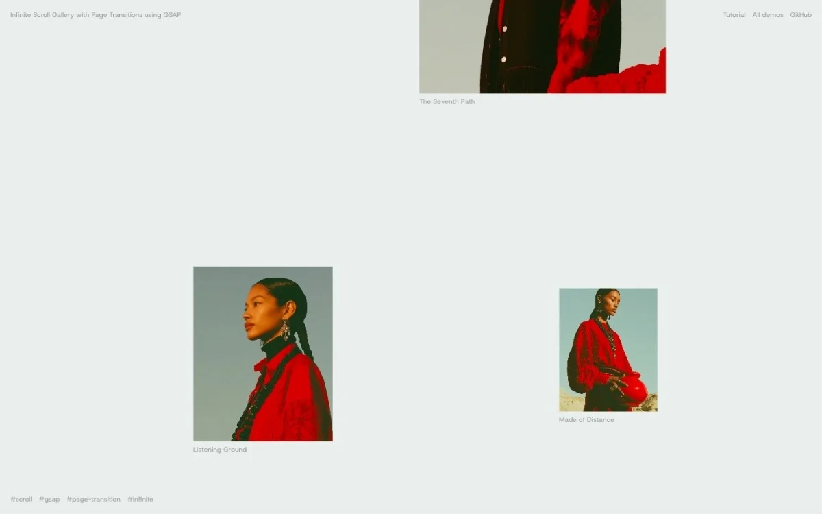
Gallery designs are ubiquitous across websites, especially in creative portfolios and agency presentations. In this tutorial, I'm going to guide you through creating a dynamic, endlessly scrolling image gallery. Each image in this assembly will move at varying speeds, generating a captivating floating illusion. When a viewer selects an item, it expands from its grid placement to a detailed view.
This guide is segmented into three distinct parts:
Slider (Scroller): An infinite scrolling mechanic controlled by mouse and touch interactions, enhanced with individual parallax effects.
Reveal: Images smoothly fade in as they transition into the viewport to prevent any jarring appearances.
Transition: A fluid morphing effect that enlarges a selected item into the meticulous detail view.
Throughout the tutorial, pure GSAP and standard JavaScript will be our tools of choice. Key GSAP features include the Observer for handling inputs, Flip for the transition morphing, and SplitText for revealing text effects.
1. Templating
HTML Structure
Let’s kick things off by structuring our gallery as follows:
<div class="gallery">
  <figure class="gallery__slide">
    <div class="gallery__img-wrapper">
      <img class="gallery__img" src="..." alt="Cliffs overlooking a deep blue bay" />
    </div>
    <figcaption>Above the Cove</figcaption>
  </figure>
  <!-- Additional slides go here -->
</div>
The detail view will reside in an overlay, initially concealed and revealed upon item selection:
<div class="content">
  <div class="content-wrapper">
    <figure class="content__preview-img"><img alt="" /></figure>
    <div class="content__group-list">
      <button class="content__back" type="button">Back (Esc)</button>
      <div class="content__group" data-index="0">
        <div class="content__title">Above the Cove</div>
        <div class="content__description">...</div>
      </div>
      <!-- Additional groups for each slide -->
    </div>
  </div>
</div>
Each content group corresponds to a gallery slide, aligned via the data-index attribute. When a thumbnail is clicked, it becomes the highlighted item; the transition morphs between content without altering markup, focusing solely on visibility and the image source for the preview. The key element, <figure class="content__preview-img">, is the destination for every thumbnail’s transition.
Styling
Next, we'll address the CSS. We'll disable the native scroll functionality to facilitate our design and ensure each item is appropriately scattered:
Setting the custom properties for gallery__slide, including --stagger to position items off-center and --img-w for width, will allow us to control visual spacing through CSS. This inclusion ensures that on resizing, we can reset parameters dynamically through JavaScript without losing the original transforms.
The calculations behind the parallax effect can be tricky, especially when trying to ensure that the visual elements align smoothly during transitions. The key lies in a proper offset mechanism. Instead of having offsets that result in noticeable jumps—most notably when a slide exits one end and appears at the other—you need to carefully manage these offsets so that they zero out precisely when the slides rotate. This prevents an awkward visual "teleportation" effect that can disrupt the user experience.
The core logic of this approach involves managing offsets dynamically. In the provided JavaScript code, the function `applyParallax` illustrates this well. It maintains an array of changes that tracks the positions of each slide as they scroll in and out of view. Here’s how it works:
```javascript
applyParallax(immediate = false) {
const changes = [];
this.parallax.forEach((item) => {
const rect = item.el.getBoundingClientRect();
const loopTop = rect.top - item.offset;
item.offset = item.factor * (loopTop + rect.height);
gsap.set(item.el, { y: item.offset });
const top = loopTop + item.offset;
const visible = top < window.innerHeight && top + rect.height > 0;
if (visible !== item.visible) {
item.visible = visible;
changes.push({ el: item.el, visible, top });
}
});
if (changes.length) this.onToggle?.(changes, immediate);
}
```
This method accomplishes a few important tasks: it calculates the position of each slide, applies the correct offset based on the scroll factor, adjusts their visibility, and notifies any relevant components if changes occur. The `gsap` library is leveraged here to handle smooth transitions and animations, ensuring that interactions remain fluid.
A notable detail is how the offset calculation requires backtracking to the position from the previous frame. By subtracting the last frame's offset from the current position, the code ensures that the slides don't accumulate offset errors, which could otherwise push them off-screen unexpectedly.
The second half of this method revolves around managing visibility efficiently. Thanks to precise calculations, detecting when elements enter or leave the viewport becomes a matter of simple comparisons. Tracking whether an element is visible allows for efficient changes without unnecessary computations.
### Handling the Reveal Animation
When discussing the actual reveal effect of each slide, simplicity is key. The animation is straightforward: fading in the slide as it enters the viewport and resetting its state when it leaves, enabling a seamless loop.
```javascript
constructor() {
this.items = new Map();
gsap.utils.toArray(".gallery__slide").forEach((slide) => {
const wrapper = slide.querySelector(".gallery__img-wrapper");
const chars = new SplitText(slide.querySelector("span"), {
type: "chars",
}).chars;
gsap.set(wrapper, { autoAlpha: 0 });
gsap.set(chars, { autoAlpha: 0 });
this.items.set(slide, { wrapper, chars });
});
}
```
The use of a `Map` for tracking slides enhances performance. The `autoAlpha` property in GSAP efficiently manages both opacity and visibility, which conserves browser resources by avoiding unnecessary repaints of off-screen elements.
The reveal logic exemplifies careful choreography—slides fade in from the top down in an organized manner. By sorting changes based on their position on the screen, this ensures that as you scroll, the opacity transitions feel intentional, not haphazard. For instance:
```javascript
toggle(changes, immediate = false) {
changes
.filter((change) => change.visible)
.sort((a, b) => a.top - b.top)
.forEach((change, i) => this.show(change.el, i * 0.12, immediate));
changes
.filter((change) => !change.visible)
.forEach((change) => this.hide(change.el));
}
```
Sorting by the `top` property guarantees a cascading effect in the reveal sequence, giving viewers feedback that aligns with their scrolling motion.
Overall, navigating these transitions requires an understanding of how every element interacts, particularly under rapidly changing conditions like fast scrolling. The strategies employed here are tuned for performance and responsiveness, creating a slick user experience that feels cohesive and well-executed.
Final Thoughts
When analyzing the interplay of these modules, what stands out is how well they contribute to a smooth user experience. The gallery isn’t just a collection of images; it operates as a cohesive unit, defined by its ability to transition and respond to user input fluidly. The slider meticulously maintains the parallax effect, aligning the animation with user interactions to avoid any jarring jumps that could disrupt flow. Let's be clear: that's no small feat when dealing with multiple layers of interaction and timing.
However, while the technical intricacies display a keen attention to detail, the overall accessibility must raise some eyebrows. Sure, there's a tangible effort to create a responsive gallery with features like keyboard navigation for basic functions. Yet, the glaring omissions—specifically around keyboard scrolling and reduced motion handling—cannot be overlooked. If you're launching this gallery in a real-world scenario, overlooking these points might alienate users who require alternative navigation options or who are sensitive to motion.
Looking ahead, consider this: enhancing accessibility isn’t just an afterthought; it extends the reach of your design to a broader audience. Implementing keyboard support and reducing motion could be relatively simple tweaks, but they would significantly elevate the user experience. The improvements in accessibility would pay dividends, inviting a more extensive user base to appreciate the gallery's smooth transitions and engaging visuals.
In conclusion, the subtle interplay between these modules is a testament to the craftsmanship involved in web development. But, to make the most of what has been built, the focus should widen beyond just performance and aesthetics. Expanding accessibility features is not just a nice-to-have; it’s essential for ensuring that all users can engage with and enjoy the gallery experience. Balancing elegant design with inclusivity could very well be the key to unlocking its full potential.