The goal for this testimonial section was to create a handcrafted experience, where each element reflects individuality, all while being powered by Webflow's CMS data.
In other words, I combined a slot-machine-style counter with a richly curated layout of member portraits, all sustained by looping animations that bring a dynamic flair. The good news? Both the portraits and the counter are responsive to CMS updates, ensuring that the content is always fresh without additional input.
Now, integrating these elements posed some interesting challenges. Webflow’s Collection Lists are created to maintain a uniform structure for each item, yet the design required a unique size and positioning for each member's portrait.
To address this while maximizing the usability of Webflow Designer, my article will explore three pivotal techniques that made this possible:
- A customizable slot-machine counter
- A carefully arranged CMS-based collage
- A dynamic GSAP animation fashioned in Webflow’s visual timeline
The Technology Behind It
- Webflow for layout and organization
- Webflow CMS for member details and counter updates
- CSS container queries + cqw and em units for scalable design
- A lightweight JavaScript function for counter animation
- GSAP through Webflow’s visual timeline for executing smooth animations
Part 1: The Slot-Machine Counter

The counter serves as the first focal point of the section, designed to engage with an eye-catching, spinning animation reminiscent of a slot machine. This number pulls directly from a live CMS entry, staying updated monthly according to my course sales. With a complex layout, I needed the counter to lead the way, setting the stage for the visual elements that follow.
Admittedly, I don't have programming expertise, so I often turn to AI for help in scripting. This approach has streamlined my workflow significantly compared to years past, where I’d manually adjust pre-existing snippets. However, perfecting the easing on the final digits was one tricky endeavor. I wanted it to ease into a soft stop, which required precise adjustments. Now, I utilize AI to create small configurators, allowing me to directly tweak the easing control to my liking.
The resulting settings serve as feedback for the AI, guiding it in generating the JavaScript. Since I frequently need similar count-up functionalities for different projects, I've developed a free tool for anyone to use: simply configure settings, export the JS, and it automatically finds the number in your text element. Counter-Up Animation Generator →
Details of the Script
While I can follow the logic of the code, I'm not equipped to assess its overall efficiency or creativity. To bypass this gap, I consulted AI to highlight what makes the script noteworthy. Here’s a distilled explanation.
The key concept: slide, don’t count. Instead of tracking a number from zero to its target, the script creates a vertical column of digits for each place in the entire figure:
- every digit fits into a cell with
overflow: hidden, precisely one line high - inside the cell is a sequence of stacked digits (0-9, repeating), ending with the target digit
- the strip moves upward with
transform: translateY, cropping everything but the visible digit, creating the illusion of spinning
This approach eliminates the need for traditional counting logic, favoring the movement method instead:
const e = 1 - Math.pow(1 - p, easePow); // the smooth easing transition
c.strip.style.transform =
  'translateY(' + -(e * c.steps * dh.unit) + dh.css + ')';
A few finer points elevate the user experience:
Spin from the right instead of distributing across the number. I wanted the leftmost digit to stabilize first while the rightmost digit spun the longest. A distribution across the entire number would cause erratic behavior during transitions, especially noticeable when moving from 952 to 1,000. By adjusting from the right, it maintains a consistent experience:
const right = chars.slice(idx + 1).filter((c) => /\d/.test(c)).length;
const dist  = total - 1 - right;
const f     = dist / maxDist;
const revs  = Math.max(1, Math.round(revLeft + (revRight - revLeft) * f));
Separate the number of spins from the time taken. A quick easing transition doesn't always feel fitting. By dividing spins and duration, I gained better control over the visual flow, particularly tweaking sliders that dictate this feel:
const steps = revs * 10 + final;                                    // total movement distance
const myDur = Math.max(0.3, durRight - (maxDist - dist) * stagger); // calculated timing
Calculate line-height dynamically rather than hard-coding it. If my header uses a line height of 0.9, a standard 1em cell may disrupt layout spacing. The script captures the current line height using getComputedStyle:
const cs = getComputedStyle(el);
const lh = cs.lineHeight;
const px = lh === 'normal' ? parseFloat(cs.fontSize) * 1.2 : parseFloat(lh);
A quick secondary script connects with the CMS to access the real number, which triggers the animation at the right moment—running only when the component is visible, ensuring efficient performance.
Part 2: The Individual Portrait Collage
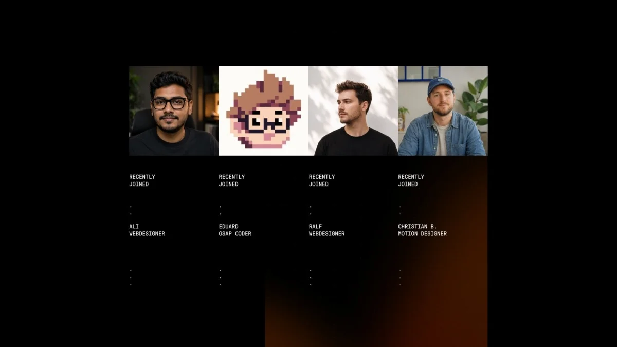
The intended design

Many users mistakenly believe this arrangement only works through custom coding or hacks—turns out, it can be crafted with a few clever tweaks.
The challenge stems from how Webflow operates. For a collage style of four portraits, each needing distinct sizes, the CMS Collection List normally constraints items to uniform layouts. Typically, creating a layout with individualized sizes requires using CSS grid, which is not an option within a Collection List.
By default, Webflow will generate each item uniformly, with the same size and replicated text below—ideal for standard lists but counterproductive for this particular design. The trick was to style the existing elements differently rather than reorder them.
I quickly realized that rather than worrying about the order of items, I could apply unique styles to different positions. Webflow offers limited styling options directly in the designer, specifically:
- First child
- Last child
- Odd items
- Even items
This led me to explore how effectively I could implement a varied design solely through these selectors, without needing custom CSS. It turns out I could achieve the look I wanted.

Each position ends up with its own width with vertical adjustments for two portraits to ensure an organic layout:
/* setting a base width, then overriding by position */
.user_grid-item { width: 10em; }
.user_grid-item:first-child { width: 5em; margin-top: 10em; }
.user_grid-item:nth-child(even) { width: 8em; margin-top: 10em; }
.user_grid-item:last-child { width: 6em; }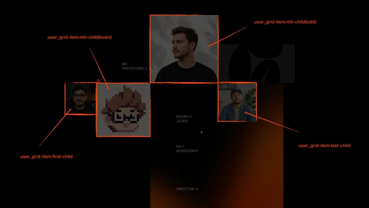
Another quirk of Webflow is the automatic repeating of names or labels beneath each item in the CMS output, which can clutter the appearance. To address this, I aggregated CSS rules to conceal all labels, only revealing them strategically for one portrait per collage:
.user_grid-item-name { display: none; }
.user_grid-list .w-dyn-item:nth-child(3) .user_grid-item-name { display: block; }
Scaling the Layout with em Units
Many followers of my tutorials notice that I frequently implement em, yet haven’t adopted it into their projects. This layout exemplifies its advantages beautifully.
The principle is straightforward: by nesting values within the user_grid-wrapper in em, you can scale the entire layout by adjusting the wrapper’s font-size. Everything resizes proportionately without extra effort.
Here’s the setup:
- the wrapper employs
container-type: inline-size, which must be added as a custom property in Webflow since it’s not an option in the standard style panel. This action makes the wrapper’s own width the reference for theemsettings - its
font-sizeis set to1cqw, equating to one percent of that width - as
emis relative to font size,1emtranslates to one percent of the container width—thus, items of 10em represent 10% of the width, and so forth - the
user_grid-wrapperfits into a broader page container that has a maximum width
.user_grid-wrapper {
  container-type: inline-size;
  font-size: 1cqw; /* 1% of the container width */
}
/* item sizes scale automatically */
.user_grid-item { width: 10em; } /* = 10% of the container width */
As a result, all four CMS Collection items will scale accordingly, alongside the gradient shape in the background—a perfect approach for this type of visual arrangement. Adjusting the base font-size alters the entire collage's dimensions smoothly.
This design strategy simplifies layout resizing. For mobile or tablet views, I swap out the cqw base for vw. As the page container utilizes full width, one vw aligns with one cqw. I then configure the collage to operate at 2vw, ensuring a more prominent display and retaining the layout’s integrity.
Part 3: Crafting a Looping GSAP Animation in Webflow
For the animation features, I leveraged Webflow’s powerful new visual timeline. This tool eliminates the need for manual GSAP coding while enabling intricate animations directly within the Designer.
Before embarking on any animations, I carefully consider the sequence. Given the section's mid-page placement, the initial animation needs to create an impact without overwhelming the viewer. Gradual reveals help ensure finer details are highlighted, as it’s easy to lose sight of them in a rapid series of movements. Therefore, the counter spins up first, followed by the remaining elements as they fade in.
The subtle scaling of mask shape gradients adds a layer of dynamics to the animation.
A noteworthy implementation is pausing the animation when it leaves the viewport, resuming when it’s scrolled back into view. This prevents unnecessary performance drain from background animations.

Adding a 3D Effect to the Member Loop
The highlight of this animation is the member loop. Since the section dynamically updates with new members, I aimed for a smooth transition of faces rather than static replacements. The implementation requires animations in both directions—one for transitioning in and another for when they're sent out. This approach enhances the text layout as it moves shallower.
To elevate the animation's quality, I refined the 3D perspective using GSAP features without having to set up complex 3D transforms in Webflow beforehand. Setting perspective and origin directly in the GSAP action-step UI was crucial.
The upcoming sections will dive deeper into configuring incoming images for optimal visuals...