Building a personal portfolio is a blend of creativity and constraint. While the reins are wholly in your hands, the freedom to choose can ironically paralyze you. When I set out to create my site, I committed to an aesthetic vision and a timeline, ensuring that my ambitions didn’t end up as just another forgotten project.
Growing up in the late '90s and early 2000s, the thrill of video game startup screens—particularly from consoles like PlayStation and Dreamcast—profoundly influenced my design choices. My aim was to evoke that nostalgic feeling of powering on a console, where each activation unveiled a new adventure. It’s not just nostalgia; it’s about capturing the essence of simpler, more engaging moments.
The Journey Begins with a Concept
To kick things off, I aimed to push my boundary. Armed with solid HTML, CSS, and JavaScript skills, I ventured into unfamiliar territories of web development. That’s where Claude Code entered the picture, facilitating my creative visions and enhancing my workflow.

The conceptual core involved a looping scroll feature overlaying a globe showcasing my work, creating an engaging way for users to explore projects via swipe or scroll interactions. Additionally, a central rotating disc would hark back to those nostalgic startup animations, enriching the user experience further.
Tech Specifications
- Three.js: Core framework for 3D integration
- GSAP: For fluid animations
- Lenis: To enable smooth scrolling
- Vite: The chosen build tool
- Web Audio API: For authentic sound experiences
- No framework: Pure JavaScript & ES modules
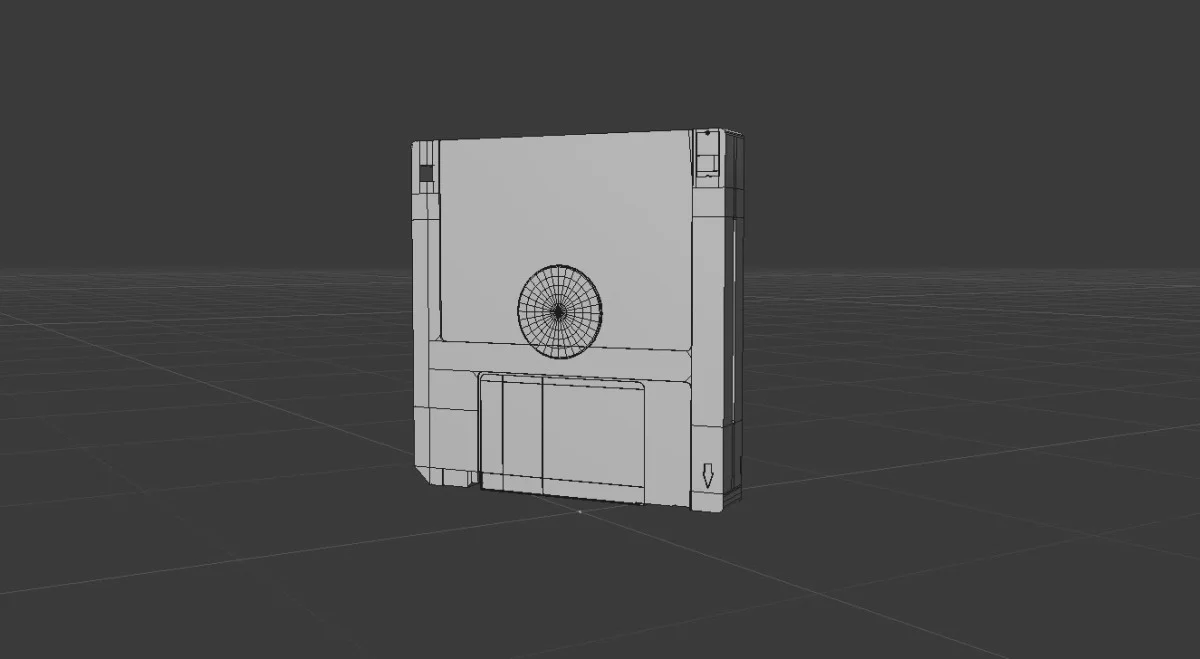
- Cinema4D: For modeling CD and Floppy Disk assets, converted to GLB for WebGL

Ignition Sequence
Ensuring that the site’s journey felt cohesive—from the preloader to project transitions—was vital. The journey commenced with an "Insert Disc" screen, prioritizing audio to elevate the immersive experience above mere visuals. The disc's rotation was implemented with straightforward CSS, avoiding excessive code while keeping it clean and effective. During this initial loading phase, I opted to swap letters for numbers in the logo to link the preloader with my branding.
One of the most complex parts involved creating thumbnails that would fan out and spiral back before revealing project details. I initially attempted to script a spiral path but soon realized that a spiral could be simplified into an angle increment coupled with a radius reduction, yielding a more organic animation.
// algorithm for dynamically positioning thumbnails
const placePreviews = () => {
    for (let i = 0; i < prevEls.length; i++) {
        const a = ((PREV_ANGLES[i] + orbit.t) * Math.PI) / 180;
        gsap.set(prevEls[i], {
            x: Math.cos(a) * prevState[i].r,
            y: Math.sin(a) * prevState[i].r,
        });
    }
};

// angle speeds up while every radius approaches zero
out.to(orbit, { t: '+=140', duration: 1.3, ease: 'power1.in' }, 0);
prevEls.forEach((el, i) => {
    out.to(prevState[i], { r: 0, duration: 0.55, ease: 'power2.in' }, 0.09 * i);
});
The stagger effect added a sense of trailing motion, where the followers of the thumbnail 'spiral' retain their orbit while the leaders rush towards the center.
The Global Interface
Throughout the globe’s creation, I faced challenges with angles that affected the visual balance. An orthographic view ultimately provided the accuracy I was after, ensuring that the globe's poles didn't distort the design. Using flat drawings of nested ellipses guided the placement for unwavering curves.
Rethinking the project strip, I opted for an approach where it doesn’t simply slide horizontally but instead arcs across the globe's surface. This design decision involved several iterations but resulted in a dynamic single texture that hugged the sphere seamlessly, creating a more engaging navigation experience.
One interesting technical note: invisible elements like the magnetic detents help ensure that the visual presentation keeps varying slightly with every interaction, making certain that the globe never appears static. Despite how subtle, this detail adds depth to the experience.
const TILE_STEP     = (Math.PI * 2) / projects.length;
const MERIDIAN_STEP =  Math.PI / MERIDIAN_COUNT;

// ensuring one tile step correlates with one meridian step
const GLOBE_SPIN =
  (Math.max(1, Math.round(0.6 * TILE_STEP / MERIDIAN_STEP)) * MERIDIAN_STEP) / TILE_STEP;
Early mobile testing revealed delayed transitions when swiping through projects. The root cause was identified: simultaneous gestures conflicted with the drag and release logic. Refining the release mechanism resolved the issue, allowing for a smoother user experience.
const dir = netDX > 0 ? -1 : 1;
// snap based on the starting position of the gesture
targetRot = (Math.round(touchStartRot / step) + dir) * step;
Interactivity at Play
To enrich user engagement, I focused on mouse interactions. Both the globe's rotation and the central CD’s spin were designed to respond to scrolling, while maintaining their inherent movements when idle.
On the project pages, hovering over project icons invokes a visual distortion that resembles a chromatic aberration. This was achieved by blending flow maps and velocity fields to create a stunning liquid-like effect. The choice to allow this distortion to decay instead of resetting provided a smoother experience that felt integrated rather than abrupt.
vec3 prev = texture2D(uPrev, vUv).rgb * 0.94;   // decay makes the trail
prev += vec3(uVel * s, s * length(uVel));       // involves velocity calculations

// red and blue sample at different offsets for a chromatic split
float cr = texture2D(uMap, uv + flow * 0.05).r;
float cb = texture2D(uMap, uv - flow * 0.05).b;
Capturing Retro Vibes
Channeling the nostalgic polygonal aesthetics of the Y2K gaming scene, I adopted a dithered approach in my site's shaders, which helped maintain authenticity. The Bayer dither functions created a cohesive display reminiscent of classic graphics.
The spinning CD at the center was an exercise in detail; I worked extensively to replicate its reflective properties and ensure that the bow-tie pattern reflected accurately based on viewing angle, adding an authentic touch to the experience.
float sweep = dot(normalize(vDiscNormalV), normalize(-vViewPosition));

// the sweep adjusts the cross's pivot point for realistic reflections
float axis = ang - sweep * 1.6;
float bowtie = pow(abs(cos(axis)), 6.0);   // creates the characteristic two-lobe cross

// edges now show hue shifts consistent with spectral fringes along dark layouts
float edge = sin(axis * 2.0);
vec3  fringe = hsv2rgb(vec3(fract(0.30 + edge * 0.22), 0.85, 1.0));
One significant benefit of Three.js is its capacity to easily apply textures to GLBs, minimizing dependencies on external texturing solutions. This efficiency significantly reduced the size of models while preserving the expected visual fidelity, enhancing loading speeds without sacrificing quality.
Smooth Transitions
As I sought to provide a fluid user experience, transitions were key. From landing pages to project views, each transition utilized a five-bar wipe effect. This ensures the project title seamlessly appears as the old view dissolves, preventing distraction from the content itself.
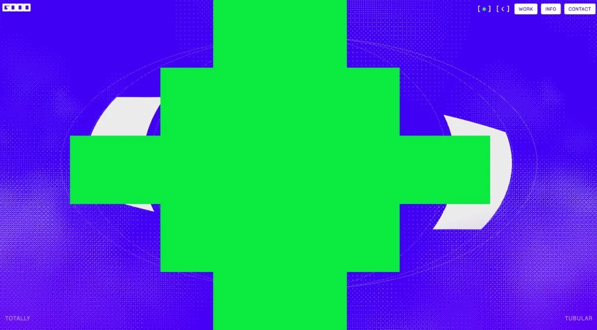


This isn’t your typical fade transition. The five bands that slide to reveal the next content are crafted to act as physical barriers, creating a dynamic effect that maintains user engagement.
// reveal managed through dynamic width adjustments for the bands
inner.style.top = `${-top}dvh`;

// collapsing bands to zero width reveals the content — leading bands create entrance
pwHalves.forEach((pair, i) => {
    tl.to(pair, { width: 0, duration: 0.6, ease: 'power3.inOut' },
        1.8 + Math.abs(i - (pwHalves.length - 1) / 2) * 0.07);
});
The page transitions are among the aspects I take the most pride in. They're not just functional but were crafted to feel alive and interactive, providing feedback during exploration. A notable feature was the scrolling progress fills on project icons, giving users a clear indication of their journey through the site.
Yet, navigating transitions proved more complicated than anticipated. To prevent user frustration, I implemented a mechanism that connects project icons to a fixed position at the top during transitions, ensuring a smooth flow when interacting with the interface.
const IDLE_MS  = 220;    // idle time for trackpad interaction
const MAX_WAIT = 4000;   // max delay to prevent hanging

const settle = () => {
    const now = performance.now();
    if (now - _swallowLastInput < IDLE_MS && now - t0 < MAX_WAIT) {
        requestAnimationFrame(settle);   // waiting for user interaction to cease
        return;
    }
    stopInputSwallow();
    _pinTop = false;
    el.detail.scrollTop = 0;
    transitionLock = false;
};
Soundscapes of Memory
The audio aspect can easily be overlooked, but it’s a defining feature of any console experience. I wanted to ensure this aspect of my site evoked nostalgia. For this, I collaborated with Lane Fujita, who understood the gaming culture as deeply as I do. Not only did he provide stunning audio, but he also included a detailed timing guide to synchronize the sound with visual events.
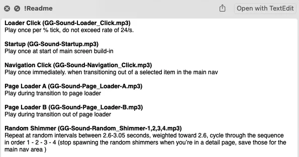
However, I encountered significant performance challenges while integrating sound. Initially, loading screens experienced lag when audio was active—the culprit? Multiple invocations of HTMLAudioElement.play() flooding the animation frame. After extensive debugging, I discovered the issue didn’t emerge in headless Chromium; using the Safari Web Inspector on an actual device was vital for troubleshooting.
The resolution involved delegating the audio management to the Web Audio API, enabling it to run off the main thread. This significantly minimized processing delays, ensuring a smoother user experience as each audio sequence synced seamlessly with the visual flow.