Reviving Nostalgia: How Decathlon's Yestalgia Collection Captures the '90s through Engaging Digital Design
Decathlon’s Yestalgia project showcases a captivating intersection of nostalgia and modern digital craftsmanship as it embraces the spirit of the 1990s. This initiative isn't merely an online store; it crafts a playful digital experience that immerses users in a joyful exploration of that vibrant era while presenting a collection of reimagined archival pieces.
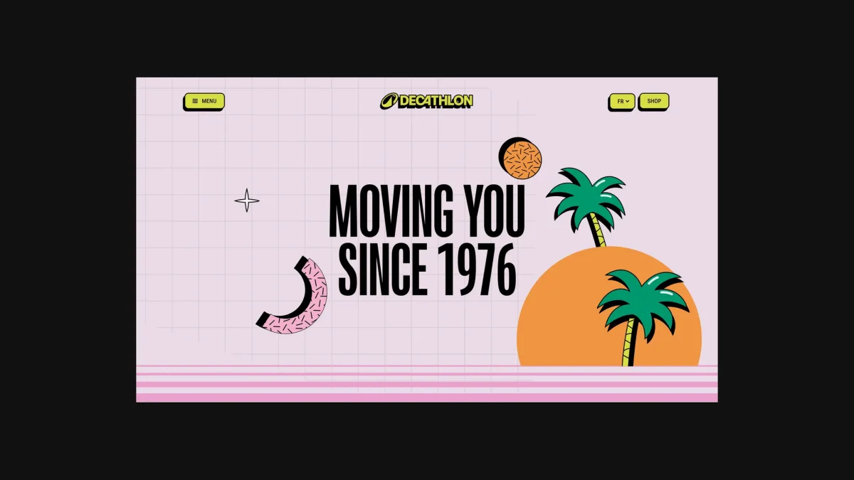
The design ethos behind Yestalgia hinges on bright colors, bold design choices, and a whimsical approach that echoes the exuberance of the '90s. By merging contemporary styling with retro aesthetics, Decathlon captures the essence of the decade through a carefully curated selection of products, all while ensuring they resonate with today's discerning consumers.
Crafting the Visual Identity
The visual narrative, shaped in collaboration with Dalkhafine, leverages vibrant illustrations and expressive typography to engage visitors, creating a space that feels both nostalgic and fresh. The challenge lay in translating this creative vision into a dynamic web experience capable of supporting a robust product launch while capturing the campaign's energetic ethos.
Editorial Design Focus
Yestalgia's layout emphasizes product visibility, featuring bold imagery and generous whitespace that transforms typical browsing into an engaging narrative journey. The design allows each product to stand out, creating a browsing experience reminiscent of flipping through a magazine rather than skimming a product catalog.

Dynamic Interface Integration
To integrate the campaign’s playful identity within the user interface, graphic elements and typography are employed as energetic interludes. By embedding these elements deeply into the visual language of the site, they enhance user engagement without overshadowing product focus, thus creating a rich dialogue among visuals, text, and interactive features.

Interactive Navigation Inspired by '90s Tech
The navigation system stands out, with its unique design mimicking a cassette player. Each cassette represents a different section of the website. This approach not only makes navigation intuitive but also adds an element of storytelling, bringing the nostalgic theme to life without sacrificing usability.
Visual Continuity through Graphics
Across the site, a consistent use of graphics woven into the design adds to the overall coherence. Subtle micro-interactions help animate logo designs, background shapes, and other visual elements, enhancing user engagement as they navigate through the site. This thoughtful integration keeps the campaign dynamic and visually immersive.

Animation Adds Depth
The design also utilizes looping animations based on the campaign's illustrations, infusing movement and rhythm throughout the site. These animations enrich the experience, making navigation feel lively and engaging while ensuring an overarching sense of continuity across various sections.
Technical Innovations
User-Friendly Development Solutions
Beneath the surface, Yestalgia is powered by a custom WordPress theme supporting seven languages. The real triumph lies in its balance of artistic vision and user accessibility, as every segment of the website is designed as a Blockstudio block, enabling easy content updates without technical intervention.
The front-end is driven by piecesjs, a lightweight framework organized around native web components. This allows for efficient performance and flexibility. For scroll interactions, the Scroll Piece integrates Lenis with GSAP ScrollTrigger, streamlining complex interactions.
Innovative Navigation through Animation
Animating the Walkman-like navigation has been a centerpiece of the project. The cassettes not only slide in and out but also snap back into place upon selection, creating a tactile experience that echoes the nostalgia of the cassette era.
Engaging Title Animations
As users scroll, bold headlines are revealed with a 3D-like effect created by thoughtfully timed animations. Each letter uses a staggered reveal that adds depth, creating an immersive reading experience while maintaining performance across devices. Mobile interactions simplify this effect for faster load times.
Vector Animation with Rive
Utilizing Rive for animations enhances visual appeal while being mindful of performance, with animations only playing when they enter the viewport and pausing thereafter to optimize GPU usage.
Responsive Motion Markup
The site successfully integrates responsive design where motion is declared directly in the markup. This approach provides flexibility without relying on separate scripts, ensuring animations adapt seamlessly to user actions.
Decorative motions such as rotating elements are synchronized across the entire page, ensuring a lively user experience without sacrificing performance.
An Endless Carousel Experience
The carousel feature benefits from GSAP’s seamless looping technique, providing an engaging visual rhythm as it transitions through various cards while maintaining user flow and interaction.
Lookbook Functionality
The lookbook section employs a thoughtfully designed mechanism that ensures consistent page height, creating a fluid browsing experience as images transition seamlessly without jarring shifts.
Technical Stack Overview
Back-end: Powered by WordPress with a custom theme utilizing Timber, equipped with Blockstudio and Polylang for multilingual support.
Front-end Technologies:
- piecesjs for front-end enhancements via native web components.
- Tailwind v4 and PostCSS for responsive design.
- GSAP for motion-driven UI elements, using ScrollTrigger and other tools.
- Lenis to ensure smooth scrolling.
- Rive for captivating vector animations.
- Tempus to maintain consistent animation loops.
- web-haptics to enhance mobile interactions.
- Developed with Vite for streamlined workflows.